Larger and Faster Storage is on the Horizon

Larger and faster storage is on the horizon!
At the current rate at which silicon-based technology doubles – approximately every 18-24 months, it won’t be long before our cameras outgrow their present storage form-factors. Nikon, SanDisk and Sony have announced their joint effort for a new portable storage specification aimed at meeting the future needs of music playback devices, digital cameras and video capture devices in a new standardized format.

The new proposed specs show a transfer rate of 500 Megabytes per second – far exceeding the present 167 Megabyte per second of the current CompactFlash specifications. Yes, that is a full gigabyte transferred every two seconds. The maximum theoretical storage capacity for the new devices are expected to exceed two Terabytes. These new memory cards are planned to be rugged, similar in size to the existing SD form-factor and have a lower power consumption and longer battery life – thanks to integrated power scaling. With the data speeds and power savings, I suspect we will see this new technology integrated as solid state drives (SSD’s) on laptops, smart phones, and other intelligent devices in sectors like medical and transportation. A projected production date for the new cards was not announced.

Getting the Best Possible Print from Your Fine Art Lab. Part 5 of 5

Getting to Know You!

Get to know the people who print your work.
A true fine-art class facility doesn’t just work for you, they work WITH you to get the print that satisfies your vision. Only you as the artist know exactly what you want in your print. Good communication skills can bridge a tremendous physical distance and result in a great print. Your master printer wants to know what you want in the print.

Testing is a critical step of this communication process.
Once a physical test has been printed, tangible suggestions can be made for changes. Get to know the lingo and the processes involved. The more you know, the more accuracy in your printer to artist communications and the less frustration has an opportunity to creep into your experiences.

Be open to hearing suggestions.
The printing technician is aware that this is your art. It’s your baby and your vision. The last thing they want to do is tread on that. Remember, they are here to print WITH you. The tech has likely printed countless thousands of fine art prints in their career and may have some truly outstanding suggestions that can elevate the print to unexpected regions. If you are willing to try their suggestions let them know that after seeing the results there is a possibility that you may want to go back to where you were. Then, if you don’t like the results, they will have been forwarned and thus prepared the files in such a way as to ensure a smooth transition back to the start.

You deserve a Great Print!
The countless hours spent by the artist from the time of exposure to the final print deserves to be rewarded. Hitting all the key points addressed in this series should bring the gift of an easier journey to a great print. If you partner your fine-tuned image file with a printer who understands how to elevate a file to a fine art print, your efforts will see even greater rewards. Sure you can still send your file to costco, or some mass production facility specializing in carnival prints, but where is the reward in that?

Getting the Best Possible Print from Your Fine Art Lab. Part 4 of 5

Getting to the final print: How much trust should you put in color profiles?

A few notes on profiles.
First, they are not a magic wand. Don’t expect them to make a so-so image look fantastic. They are NOT a repair tool, they are a color matching tool intended to get the output to mimic the actual contents of your file. Also, profiles are made by reading the values of sampled output of less than 1/100th of a percent of the colors available in 24 bit RGB. That leaves the remaining 99.99% of colors to be guessed at by the software that uses the profiles. Expect an improvement in color approximation, not miracles. The most predictable results occur when the working space and the printer profile are close in gamut. Meaning a large gamut Ektaholmes or ProRGB will convert less dependably to a smaller gamut device.If you are finding unpredictable results when using profiling, you may wish to consider using a smaller working space such as Adobe 1998 for future images.

Test and test again if needed.
While the digital age and color profiles appear on the surface to make all things equal, the truth is that a master printer is still required to get a master level print. Profiles may speed up the initial proofing process, but the finer nuances of a great print require a trained eye and a master of the craft. It is a very rare set of conditions that will come together in perfect alignment to allow a glorious print to happen with the very first test. In my opinion, a fine art print should leave zero room for improvement in the print. If you can sit with the print for a couple of days and not find anything to change, congratulations. Print your finals. An artist with a critical eye will always be seeking to improve their product. An acceptable print could be called and art print. It takes more than acceptable to get the tag of “Fine”.

Share your own experiences by leaving a comment!

Part 5: Getting to know you.

Getting the Best Possible Print from Your Fine Art Lab. Part 3 of 5

File optimizing and sweetening.

If done properly, this is an area in your work flow that can really make your image sing. Gross corrections in color and density should have been handled using Bibble as your raw converter. Fine tuning localized areas of the image such as burning and dodging can be handled in Photoshop or Gimp using curves with masks. For saturation adjustments, I prefer to use selective color over hue/sat, when I need to add more red to the reds, more blue to the blue, etc. I have found that using hue/sat is more likely to cause banding and other visible damage in the color channels.  Sharpening happens in several steps for me. First pass of sharpening happens in the raw conversion stage. I sharpen there, just enough to tighten up the pixels while avoiding halos and edge artifacts.  After sweetening the file in Photoshop or GIMP, I will scale a print ready file for output and sharpen according to the type of output. If I am just using unsharp mask, I prefer to sharpen using a high percentage – 400-500% with a low radius. 0.3-0.4 and a zero threshold. Else-wise, I will use a modified version of a hi-pass sharpening. I’ll cover that method in another post.

Once sharpened, I will convert to an output profile appropriate for the printer the file is to be imaged with. After this convert to profile step, I will carefully examine each of the three color channels for the presence of banding or other artifacts related to the profiling. If the artifacts are concerning to me, I will undo the convert to profile and print using the working color space. I ALWAYS test any file before printing large, and I recommend that others do the same if you are looking for the “best” print. Files submitted for printing in a large working space tend to need additional saturation – 12-18% for the first test. Then I will tweak the file a bit more based on the first test. If I had to make dramatic changes, then  a second test is warranted.

Share your thoughts and ideas by leaving a comment

Next from me: Getting closer to the final print: How much trust should you put in color profiles?

Getting the Best Possible Print from Your Fine Art Lab. Part 1 of 5

The end result of a great print is always the sum of it’s parts.

Every step along the way, from the click of the shutter through file preparation, all the way to print presentation choices, affect the visual appeal of the print. This author/artist believes that a fine art print does not lie strictly in the quality of composition and subject and use of light all brought together by the skill and talent of the artist, but also in a higher level of reproduction print quality.

Any factors that diminish the color fidelity and detail of an image, in my opinion, risk pushing the print away from fine art grade into Just Another Print. In other words, A fine image needs a fine print to qualify as fine art. Selling cheap, or poor prints as fine art is to me, analogous to selling posters as fine art.  The phrase “best possible” is a bit elusive, as “best” is often subjective. Meaning that you and I may have differing opinions of what an optimum print looks like. So knowing that the target may be moving subjectively, let’s look at what can be controlled to yield YOUR ideal of the perfect print.

Get the exposure right.

Proper exposure leads to the highest possible color fidelity with the greatest number of available levels of density. Under exposure leads to noise and grain in the image, while overexposure leads to loss of highlight information. Often we hear the cry of “I’ll just fix it in Photoshop!” While software offers us access to many tools that allow the user to attempt compensation for exposure issues, they will not fix the loss of fidelity or restore detail that is lost during improper exposure. The bulk of the density and color can be brought around from poor exposure to acceptable ranges, but the finer levels of information are lost forever. Use a quality calibrated hand-held meter or carefully watch your in-camera histograms to ensure your highlights, assuming your image is supposed to have them, fall below 100% white and you should be good to go.

Part 2: Is file format – tiff or jpeg –  important?

Leave me your comments. I would love to hear from you.

Learn about Tiff versus jpeg. Does Size Really Matter?

Is Bigger Always Better?

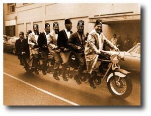
men on a very large bicycleYou are probably frustrated with the Tiff vs Jpeg debate. The truthful answer is not one of always use this, or never use that.  Like cars versus trucks, they each have attributes that make them well suited for certain tasks and not others. Often we are asked to describe the difference between tiff and jpeg files. While they share a few similarities, there are a few differences and particularly some characteristics in the Jpeg format that any individual looking to get the very best image quality should know.

A Tiff file (Tagged Image File Format) and a JPEG file (Joint Expert Photographic Group) are both raster file types. A raster is a grid, and raster images have their pixels (picture elements) arranged in a grid pattern – like a chess board with a large number of squares, with each square being assigned a color and density value. When the squares get small enough that our eyes cannot see them individually, they blend together to create the image.

Both file types contain what is called “Meta Data”. Meta originates with the Greek language and means beyond or above. So meta data is information that is above or beyond the “normal” data in the file. In this case, the data that forms the image. This meta data may contain image relevant information such as what color space the file is in, what embedded or assigned color profiles are of note, the actual file type – tiff or jpeg, image dimensions in pixels and inches/cm, a thumbnail preview and some pertinent info that software uses to rebuild our image file from the raw data. This meta data may also contain additional extended information that is not used to display the file, such as the type of device used to capture the image, i.e. what camera or scanner, exposure settings, flash settings, date, time and even GPS co-ordinates and copyright information if available. This list is not intended to be a complete technical description, but just enough info to give you a general idea.

JPEG files use a variable compression scheme to throw information away, thereby allowing the stored image file to require less file size. Jpeg compression is fairly intelligent. The software throws data away to save space, then the application that opens the file uses information embedded in the file to “rebuild” what the lost data might have looked like. The more data that gets discarded, the less there is for the software to base it’s rebuild on and we begin to see anomalies, or what are called “artifacts”. The authors of the JPEG standard knew that the human eye is far more sensitive to density information than it is to color. So color information sees the most loss of detail. Maintaining as much density information as possible here is key to keeping as much quality as possible. While this does effect color-detail, this process is nicer to look at than throwing out the density detail. Our eyes are less likely to see a smearing of the color than smearing of the detail. At higher levels of compression, more information is discarded, including more of the density detail, resulting in an image that looks blurry, or grainy. Some applications such as The GIMP – http://www.gimp.org/ – allow the user flexibility to increase compression in the color only, and leave the detail alone, thus allowing for a bigger bang for the compression buck. One of many nice GIMP features that Adobe could learn from.

Mid Level CompressionLow Quality-Maximum Compression

Max quality - Minimum Compression


Jpeg likes to work in 8 pixel by 8 pixel blocks and any one block has no idea what the next block contains. This can result in the borders of neighboring blocks failing to match for color and density. As levels of compression increase, these blocks become increasingly apparent to the viewer because the “rebuild engine” in the software has less original information to work with and therefor errors will be greater.

The tiff standard had it’s birth in the desktop publishing world as a proposed standard amongst desktop scanning devices. It is widely accepted as one of the image format defacto standards for printing and publishing. The other being EPS. Many consider tiff to by synonymous with uncompressed or lossless compression. This is a false assumption. While the baseline (basic level) of tiff is either uncompressed or uses a lossless line level compression, a tiff file can also be a “container” for a jpeg compressed file. This jpeg-in-a-tiff scenario is subject to all the loss and limitations of any other jpeg file. So be aware that a file with a .tiff extension may not have all the integrity you are expecting.

Tiff’s early days were very limiting. The format supported only 1 bit of data per pixel – meaning black or white. No gray and no color. Over the years the tiff standard has expanded to support ever increasing bit depths and files up to 4 gigs in size. Files over that size use a format called Big-Tiff.

Just in case this whole file comparison thing is not quite “geeky” enough for you, here is a fun fact; The third and fourth bytes in a tiff file alway represent the number 42, which is a nod to “The Ultimate Answer to the Ultimate Question” in “The Hitchhikers Guide To The Galaxy” http://en.wikipedia.org/wiki/Phrases_from_The_Hitchhiker%27s_Guide_to_the_Galaxy#Answer_to_the_Ultimate_Question_of_Life.2C_the_Universe.2C_and_Everything_.2842.29

And they say programmers don’t have any fun.

The tiff standard has been expanded to include support for multiple “pages”. Just like a layered photoshop file. Adobe, who owns the rights to the tiff format, have taken advantage of this flexibility and allow layered photoshop files to be saved in the tiff container, alongside a “flattened” version of the file so that standard tiff reading applications can provide you with a usable composite image.

So I hear you asking: “Which one is best?” This of course depends on your needs. For general photographic and fine art pigment printing, file quality is a majority factor in the final print. Lossy compression means less than stellar printing. So use jpeg if you must, but compress it as little as possible. If you are using tiff, if you must compress, avoid using jpeg compression and go with line level compression. LZW for example.

Now if maximum quality is your biggest concern. Stop shooting JPEG in your camera, unless your raw files are compressed too. Many manufacturers only provide compressed raw.  Check your camera specs. If you aren’t gaining anything by shooting raw, then go for JPEG and save the space. If you have an uncompressed raw or a tiff option, these will yield the best file integrity but take the most room in storage.

If storage space is your primary concern, then jpeg is your friend, at least until camera makers are willing to include lossless compression in their firmware, and it is unlikely they will until there is a demand for it. So if you think it’s a good idea, write your manufacturer and request it.

Want more on shooting Raw vs Jpeg?  Check out my blog post on that topic here

Have a question? Put it in the comments below!


Getting the Best Possible Print from Your Fine Art Lab. Part 2 of 5

Is File Format Actually Important?

Last week in part 1, I wrote about a print being the total sum of all the parts in the workflow and how each part plays a role. We also touched on the importance of proper exposure for a good starting place. As promised, this week I expand the parts to cover gear and the common question of file formats.

Good gear.
If your lenses are of poor quality, don’t expect your images to be ready for fine art printing. Aberrations distortions and flares, like exposure, can only be somewhat compensated for, but not completely repaired in Photoshop. ANY distortion corrections in Photoshop means that your pixel data will be re-sampled. And re-sampled means it will be softened. Flairs, result in lowered contrast that equates to lessened detail, and repairing apo-chromatic errors requires re-sampling one or more channels. It’s preferred to handle this during raw conversion  but it still requires a re-averaging or re-sampling of pixel data.

File format.
For a fine art image, Unless jpeg artifacts are part of your style, (see my blog post on tiff versus jpg issues here) I recommend that the image be captured in an uncompressed raw format. Some camera manufacturers force users into either jpeg or compressed raw formats. For the wedding and portrait guys. This is usually fine. Their critical gamut for color lies mostly in the skin tone ranges of their subjects and the rest of the world is secondary. In a fine art print, the rest of the world is the artists domain and critical for color. JPEG compression throws color information away first at the higher quality levels, then moves on to also discarding density detail as the compression level increases. I have yet to see a digital camera that will hold the same level of color fidelity in the compressed file, that can be had in an uncompressed raw file. With the rapid pace of camera development, I imagine this issue will be corrected in a few years, if not sooner. I suppose we’ll just have to wait.

Do as much of your color correction, saturation work, density tuning and sharpening during the raw conversion process as you can.  Any resampling of color post-conversion can lead to lesser results when levels of density in each color channel are expanded, leaving gaps that cause rapid transitions in color, or compressed, causing a loss in color fidelity. Am I nit-picking here? Could be. But remember, the topic is getting the best possible print.  Nit-picking get’s you to that end. Shortcuts might get you an acceptable print, just not the best print possible.

File conversion.
The software used to convert your raw files can also go a long way to make or break your image.  For several years, I have been using Bibble Pro to convert my raw files. Side by side tests with current adobe products show that Bibble preserves more color fidelity and introduces virtually zero artifacts into my files. Adobe products appear to be using an interpolation scheme that sometimes creates zipper lines on hard edges and at other times, completely softens color detail in some of the channels.  When my distant Autumn aspen trees look like cotton candy in the red channel, missing all semblance of leaf detail, something is horribly wrong with the adobe raw converter.  Prior to final file work, I always convert my raw files to a tiff in a decently sized working space such as ProRGB or Adobe 1998. Especially for anything I will be printing on either photographically on the Lightjet or Pigment on watercolor or canvas.

Let me know your thoughts. I would love to hear your ideas.

Next from me: Sweetening the print through fine-tuning.

How big can I print my file?

Here is another great question we hear quite often. Sometimes more than once a day. So it seems low resolution file showing pixelsa relative bit of information to pass along here to our blog reader friends.

There are two valid answers to this, depending on whether we look at this as a relative issue or a subjective one. As a relative issue, we use math to compare number of file pixels versus output resolution. Subjectively we look at quality as simply a matter of personal taste – what I like to call “The quality to pain threshold”. Or how big can we go before the quality drops to where it becomes painful to look at or pay for.

First, in either point of view, image quality is more than just the number of pixels contained in the medium resolutionfile. For a simple example; a modern 24 mega-pixel file shot out-of-focus will be of lesser quality than a properly focused 4 mega-pixel file.

Let’s look at the relative approach first, since most folks like easy and firm answers, such as 2+2 always = 4, and George Washington was the first US prez.

The easy answer is achieved with simple math:

File pixel dimension ÷ minimum input resolution = output dimension.

Consider this:
The example camera has a pixel dimensions of 2000×3000 (6 mega-pixel)
and the example device wants a minimum of 300 ppi (pixel per inch) file resolution.Full resolution file uncropped

2000÷300 = 6.66″
3000÷300 = 10.00″
The largest maximum quality print size would be: 6.67″ x 10.0″

If your printer recommends a minimum of 150 ppi:

2000÷150 = 13.33″
3000÷150 = 20.00″
The largest minimum quality print size is 13.33″ x 20″

If your file is from a 24 mega-pixel camera with dimensions of 4000×6000:

4000÷150 = 26.66″
6000÷150 = 40.00″
The largest minimum quality print size would be 26.66″ x 40.00″

With the subjective approach, there are limited fixed answers. The size of output is usually limited by one or more of the following factors:

* The physical limitations of the printing device.
* Your budget.
* How ugly you are willing to accept it.

At some point the cost of the print will break your budget. That is a hard and fast limitation. So that’s easy – you can print as big as you want to go as long as you can afford the print.
The printing device or medium will support a maximum specific size. For instance, some ink jets will not print any larger than 40″ wide, but they will go several hundred inches long. You can’t go any larger unless you pick a different printing device or you print in multiple tiles and deal with matching the seams. If you are willing to do the latter, then your budget is again your limit.

The subjectivity comes in with your opinion. How big is too big before the quality drops below your level of acceptance – your threshold of pain. Or you might call it the “Yuck factor”. When you get to a level of enlargement that degrades the quality to a point where you don’t like the results, you have hit your threshold of pain. In essence, you see the print and say “Yuck! That’s one ugly print and I’m not willing to pay money for it”

What does the yuck point look like? I can’t answer that for you, only you can. My level of acceptability may be different than yours. A professional’s need for quality is likely higher than that of the average consumer due to experience and training. Because of this experience, the professional will usually hit his/her level of pain sooner than the consumer.

What “they” might not be telling you about the flaws in ICC profiled workflows.

Profiles are typically generated using less than .016% (yes that is less than 16/1000 of one percent!) or 16/100,000 of the 16.4 million colors available in 8bit RGB. Talk about a shot in the dark. There is a tremendous amount of mathematical software based “guessing” that occurs in the ICC color management process.

Profiles are 100% dependent on consistency. They only work if you have consistent input and consistent output. Lenses used in capture, accuracy of camera white-balance calibration, scanner calibration, conditions in process, paper, chemistry, ink, equipment condition, light sources, supply voltages, time of day, humidity, blah blah blah can all have an impact on product output or digital input. These conditions are all subject to change, and do change. Thus, profiles are at their most “accurate” for the moment the profile was created. As these conditions drift and change over time, they effect the “accuracy” of the profile. Many individuals in our industry have touted that profiles have an expectation of consistency. One that unfortunately just does not exist in real world conditions. Through equipment care and high levels of professional level calibrations we attempt to keep our input/output equipment “calibrated” to the same standards on which the profile is based. In theory, this causes the final output to float around the bull’s eye and stay close to the expected, rather than take a direct bee-line away from it and continually get further off-target.
A good lab will calibrate their devices back to factory standards several times during a production day.  This is done to compensate for process variables that occur over time, and changes in paper from batch to batch.
My goal here is to help you become aware that though profiles are often elevated to a high stature as an end all solution,  they really fit more into a false-god category.

Now this is not to say that profiles are useless. Far from it in fact. They can have a dramatic impact on overall color approximation across multiple devices. Such as getting your ink jet to approximate your file and to get our LightJets to approximate that very same file. In fact we use profiles in-house to get our LightJets to approximate the smaller sRGB color space of the Fuji Frontier prints. Due to the larger available gamut of the LightJet, it is more likely to get the LightJet to approximate the Frontier than the other way-round. And we use them in some profile dependent work flows such as our professional digital press, and our Durst Sigma scans. The software that drives these devices, will not function correctly without profiles in place. The truth is, most digital capture and print sotware have some sort of embedded profiling built in. Your digital camera for instance, needs to know the characteristics of the dyes used to filter the image sensor in order to deliver a density and color accurate file.
I believe that any NON-DESTRUCTIVE method of producing better color has the potential to be a good idea. I’ll again stress “NON-DESTRUCTIVE”.  I am a big proponent on avoiding color channel damage whenever possible.  The caveat to forcing a profile on an image is it’s potential for color channel damage. I have seen many files where the colors were pushed too close to 100% saturation prior to a profile conversion. The resulting breaks/banding is inevitably and incorrectly blamed on the profile.

The great thing about ICC profiles in your work flow is their potential to get you closer to your target. They are by no means any guarantee of a bull’s eye, an exact match, perfect color, or any other false promise you have heard or at this point still believe. I often use this analogy: “Profiles are like a ticket to a baseball game. They get us in the gate, and might just get us a good seat, but that ticket will never allow us to sit on home plate while the batter hits a homer. BUT, that good seat is still much better than listening to the game on the AM radio while sitting in the parking lot.”

So, better. It’s just not a guarantee.
Profiles, in a nutshell, describe the devices available boundary or gamut as well as the limitations or inaccuracies and should not ever be confused with or used as working color spaces. They are far too small for use as a working space and should be thought of something to move colors <to> not <within>. Banding/breaking/clipping will likely result if you should choose to ignore this. It is best practice to use a working space that is larger than the output space, then allow your profile conversion to remap to hold detail.

If you remember my remarks regarding consistency, these constant changes diminish profile accuracy.  So why do we make a profile available for our printers? Well, quite frankly, because in most cases, an perceived improvement in print quality will result from a proper color-managed workflow.

One exception to this is our Fuji Frontier. This device is specifically calibrated to work within the sRGB colorspace. It’s output gamut is limited of course by the capabilities of Fuji Crystal Archive paper, but this design will allow a photographer who is color-calibrated and working in sRGB to be free of output profiles. One less layer of potential damage to the file.
So how should you be using your profiles?

Let’s start with what NOT to do.

If I use profiles in an attempt to get one device to approximate the characteristics of another device, I am in essence, attempting to get device A to look like device B, and both devices inaccuracies will be included! This is a great example of Square Peg I A Round Hole. If the gamut (outside edges of the pegs) of device A do not match the gamut (profile outliers) of device B, loss will occur. Much like using a hammer to get that peg in – you’ll shave off some of the peg, and what is left does not completely fill the hole.

In fig.1 above, the LightJet Fuji Matte has the larger gamut.The darker looking cube inside that area is the gamut of the Epson Enhanced matte. The bit of gray peeking out at the bottom is the zone where the Epson’s gamut is a bit larger than the LightJet. The area labeled Profile Overlap represents the available colors that both devices share. So this would be the available gamut when trying to match one of the devices to the other. In other words, all of the areas outside the overlap would be lost. In my opinion, that is a pretty large chunk of color to toss away just for the gratification of getting two prints to look as close as possible to one-another.  In essence, we would be “dumbing-down” the quality of our final print.

Good profile methods will attempt to “re-map” or squeeze those outside colors to fit within the range of output (the square hole), but the missing colors (the corners) aren’t properly restored. This results in a sacrifice of color fidelity from the original file.

So if you still want to profile, this is how I approach ICC profiling for Maximum Color Fidelity. At least within the limits resulting from profiling.

Let’s assume that we have:

– A source file: test.jpg
– Ink jet printer A that lets say: prints Blues with too much Green,
– and I have printer B that prints Reds with too much Yellow.

So:
A) +Green cast in Blues = Damaged Color
B) +Yellow cast in Reds = Damaged Color
ICC Profiles = Attempted Damage Reversal (at least in theory anyway)

Example 1: Try to get Printer B to look like printer A with one profile – bad Idea

If I print test.jpg on B, trying to approximate A via A’s ICC Profile, I have a print that has the native issues of too much Yellow in the Reds, and because we told B to look like A, I also have too much Green in the Blues. Why would I want a print with both sets of issues?
Damaged Color + Damaged Color = MORE Damaged Color.

Example 2:  Try to get Printer B to look like printer A with two profiles – best idea for closest approximation between printers 

I print test.jpg using profiles for both printers. I tell my software to make B look like A, but use B’s profile too.
So now the output attempts to remove B’s issues, the Yellow cast from the Reds.
BUT, because I am still approximating printer A, I am still introducing the Green cast in the Blues. So now I have at least one printers issues in full glory.
Damaged Color + (Damaged Color + Attempted Damage Reversal) = Damaged Color. Still some loss, but I should have two prints that are fairly close.

Example 3:  Try to get Printers A and B to look like the source file – best idea for maximum fidelity to source file.

Rather than attempting to get A to approximate B, We print the file to each printer, avoiding an approximation between the printers.
Instead, we want to allow each printer to get as close to test.jpg as possible. So we print test.jpg to A with it’s profile and to B with it’s profile.
A) Damaged Color + Attempted Damage Reversal = Less Damage.
B) Damaged Color + Attempted Damage Reversal = Less Damage.

So rather than compounding issues or keeping some and removing some, in theory, both prints are now as close as they independently can be to the original contents of the test.jpg file.


TIP!

Nothing in nature is saturated to 100% of any given color. There will always be some absorption of wavelengths of all colors. So don’t push your files thinking the final product will still be believable or still hold detail. The closer to 100% you push the saturation, the closer to zero you push the detail. And please don’t blame your profiles for damaging a file that was pushed too far.  Perceptual profiling is just not designed to work with a lack of color fidelity and you just might be wasting your hard earned cash to get a print you don’t like.

If your preference is hyper-saturation, make sure to match image type to printer type. For example, if you like saturated yellows, you could be printing to a device that can actually reproduce the brilliance you are seeking. Giclee printers are a great example of this. Being an ink-jet, they are quite capable of reproducing intense yellow as this is one of the native ink colors on the device.The same holds true for the other two colors, Cyan and Magenta. When you add any two or more inks together to create a new color, you are adding density and reducing saturation. With the advent of the intermediate “photo” colors, some of the subtler in-between colors are now improved. On the LightJet, the Kodak Metallic paper holds more saturation than Fuji Crystal Archive, but the blacks are not as rich nor as neutral.
How to get great color, save your profits, and never have to work color or density in Photoshop. Part 1

I’m going to fill you in on the secrets of how to get great color, save your
profits, and never have to work color or density in Photoshop. All without
the use of ICC profiles, confusing work-flows or batch conversions.
If you understood the above and it applies to you, chances are you are a
professional photographer. Professional print quality is much easier to achieve
than most photographers are aware.
Getting there requires Five crucial elements. With these five in place, you can go
directly from camera to print and get excellent results.
Yes, that’s right, higher profits and more free time with:

  • No Photoshop work.
  • No profiling magic.
  • No bag of tricks or fairy dust.

Rule #1 – If you have to adjust the density of your files, your metering is
inaccurate.
You may find this hard to believe, but truly consistent exposures rarely come
from TTL metering. I know that’s tough to swallow, but reflective metering is just too fallible.
Don’t believe me? Here is a simple test to see if this rule applies to you.
1. Take a look at the average corrections you are making on your files in
Photoshop or Lightroom.
2. Jot down the number of exposure and color balance corrections you make
in a work week.
3. If the answer is any higher than zero, guess what, I’m right – your TTL has failed you. So how do we
correct this?
Get a GOOD new or used hand held incident flash meter, and calibrate it to your
camera using Will Crockett’s “Face mask Histogram Technique” copy and paste
the following web address into your browser: Go to
http://www.shootsmarter.com/index.php?option=com_content&task=view&id=116&acat=16
Keep in mind that digital cameras have only 1/8th stop of exposure latitude. If you
have an incident meter, compare it against Will’s meter reviews and see how it rates. Some
well known meters are unprofessionally inconsistent . Up to a horrible deviation of +- 1/3 stop from
reading to reading. This is definitely outside of the acceptable range for a
professional photographer by approximately 300%! In other words, that exceeds
professional limits for exposure control by 3 times.

Next week:
Rule #2 – If you don’t have custom white balance, you don’t have correct color.

To make sure you get the rest of this series, you can subscribe to this blog at the top of this page.