—Photo ilustration by Greg Osborne
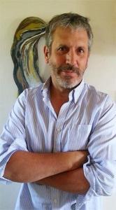
Photographer/curator /artist and probable wearer of many other hats, Mark Sink has been as integral to the Denver art community as a certain quarterback has been to the Denver sports scene. An artist who, despite his many successes, has remained as easily approachable and true to his art as he was as a kid studying painting and printmaking at Metro State College in the seventies. Sink is a strong proponent of the ‘less is more’ school of photography; capturing stunningly beautiful images with low-tech tools like the Diana toy camera and the age-old Wet Plate Collodian process. As he made a point of telling us: “My career is very non-photo serious, I’ve used toy cameras much of my career. I’m a ‘reverse technology-o-phile’— going the other direction, you know? The Big Picture comes from that.”
Amongst his many achievements, Sink is responsible for Denver’s Month of Photography (MoP), one of many “Month of Photography” events around the world that bring together an eclectic mix of local artists, galleries and creatives for a month long celebration of the art of photography.He also used the camera obscura in his paintings to help with architectural alignment.
Reed Art & Imaging sat down with Mark in the kitchen of his home in the old Highlands neighborhood of Denver to talk primarily about MoP, but it was hard to limit the conversation to just one facet of a thirty five-plus year artistic journey. The life of Mark Sink has been anything but uneventful…
First of all, Reed Art & Imaging would like to offer our congratulations for your recent selection as the inaugural recipient of the 2013 “Hal Gould ViP Award” (Vision in Photography) for your many contributions to the local art community. Can you talk about what it means to you?
Well, it’s a great honor. Hal is one of the biggest figures Colorado has had in photography. He was forwarding photography before it was considered an art form. The Director of the Denver Art Museum, at the time, Otto Bach said, [affects an overly-officious voice] “Photography will never be shown as art in our museum.” So Hal parked his Camera Obscura Gallery right across the street— and not by accident! He was a photographer himself and was one of the co-founders of the Colorado Center for Photography [CPAC}. He championed Ansel Adams and sold his prints at his gallery for $150 a piece. His real estate stories themselves were something!
How did the award come about?
The Colorado Center for Photography felt that there ought to be an annual award to recognize people who have been forwarding photography throughout the years, so they put it together just to do that.
For those who might be unfamiliar, can you fill us in on your background? Give us, if you will, a quick Mark Sink Time Line to the present, or as far back as you care to go.
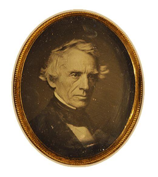
Samuel F.B. Morse
— Photo courtesy of Mark Sink
As far back as I want to go? Well, it gets pretty hairy if you go back within my family, if we’re going to bring that on [smiles]. Well, starting with Samuel Finley Breese Morse, he took the first photograph in America; the first photographic portrait ever taken. He’s my great uncle. He was a portrait painter who invented the Morse Code. He also used the camera obscura in his paintings to help with architectural alignment.
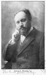
Photo courtesy of Mark Sink
My great grandfather, James L. Breese, was a portrait photographer in New York City in the late 1800’s. I currently use his cameras. Here– I can walk you around. [Sink proceeds to give us “The Tour” of his home, a veritable treasure trove of historical artifacts, photos, art, and camera equipment, etc.]. He was the founder of “Camera Notes” that was put out by the Camera Club of New York with Alfred Stieglitz. It opens on the first page saying [Sink reads from an old hardcover copy of Camera Notes] “James L. Breese, primary inspiration of the Camera Club of New York…”.
Here’s an example of some of his work with Cosmopolitan Magazine, in one of these from 1892, there’s a fantastic article where he describes “The relationship of photography to art”. That was pretty early on.
James Breese started the Carbon Studio where they had a wild party for his best friend, [architect] Stanford White, [reading from article] “…when the pie was breeched, out of the crust, a flock of canaries accompanied by [a naked] sixteen year old Suzy Johnson…” . That was the first girl popping out of a cake – well, a pie at first – that’s where that all started,
From the nursery rhyme? (Sing a Song of Sixpence: four and twenty blackbirds, baked in a pie…)
Right! So, of course, it basically credits James L. Breese here: [reading dramatically from article] “Soon the studio and his Carbonites came under fire as the secret place of lascivious intrigue, and was used by a number of well known photographers. Breese was the ultimate ‘social register’…”. So, basically, they’re saying James L. Breese was the reason for his [Stanford White’s] downfall.
Yeah, he ran around with a pretty fast crew. [laughs] Got in a lot of trouble. There was this gigantic scandal that happened with Stanford White, who was going with the super-model of the time Evelyn Nesbitt (the original “Gibson Girl” in popular advertising of the era) and was later murdered by her husband, who walked up to him at Madison Square Garden and shot him dead. It was called the “Crime of The Century”.
But all that is a book someday…his life. Anyway, it’s exciting to use his equipment.

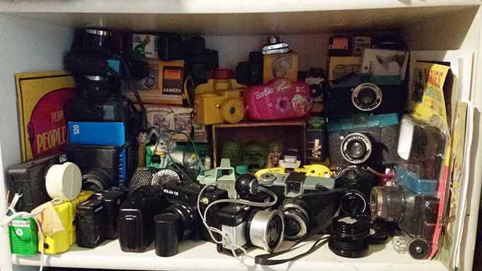
Just a few of Mark’s “toys”
— Photo by Gary Reed
Then in here, of course, are cameras that I use regularly. The Diana I used for a large part of my career. I use these 19th century box cameras, they work fantastic for the collodion wet plate process. And this plastic Ansco panoramic that you can still get for $6.95, it’s the “Diana” of wide angle photography. There’s also the Lensbaby on an SLR; it shifts the plane of focus, like what you can do with 4×5 view cameras, so you can make your eye focus on one thing and make everything else drop away. It became a super-sought after advertising tool. I can show you examples in print and TV, it’s become very common for food photography where it will show you one thing in focus and everything else drops way, w-a-y out of hard focus. Some portrait photographers have adopted it to give a sort of dreamy, pinhole effect. Well, you all saw my toy camera workshop, lots of tips– tiny little tips like that.
.
Currently, I’m very excited, my wife and I are working with this rare Japanese tissue doing a platinum and Cyanotype mix using UV exposure. We’re having fun gardening outside and exposing the prints for about ten minutes while we pull weeds and stuff . When they’re ready we just wash the prints out with water.
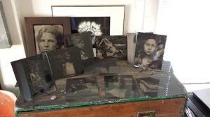
Some of the Sink’s Wetplate photography
— Photo by Gary Reed
We have to ask. Andy Warhol?
Oh Andy. Just today, Christie’s is auctioning off a picture of ‘Me and Andy’. I was there. I didn’t even know it was happening, It showed up on Facebook. There’s a gazillion interviews and stuff that you can find on my blog.
Okay, we’ll check them out, but is there anything that you haven’t talked about much?
Well, you know, it was a super, super lucky chance to be able to introduce myself to him and connect with him in Fort Collins where they were having an exhibition in his honor. He put me on staff with Interview magazine that day. I was an aspiring photographer in school and Interview magazine was like god to me. I told him that and he said, “Oh well, you can represent us in Colorado!” I was on the masthead the next month. I was going down to the Metro State College and it was a funny two worlds you know. I would go and hang out with Warhol and [have] dinner with Mick Jagger and come back and develop my film in the film lab. You know, it was just so strange. People would go, “That looks like Mick Jagger!”
So it was back and forth between two polar opposite worlds?
Back to struggling, starving, putting myself through school at Metro-world, developing my own film in the darkroom. So, after about a year I figured I should pack up the car and head out to New York. New York went great guns except that the commercial studio world was not quite what it was cracked up to be in art school, shooting catalogue work and editorial things, and zero artistically speaking. So I was really kind of wilting – making great money – but wilting. So I started a little darkroom and started printing my Diana work again and got a little show and I started photographing work for other artists.
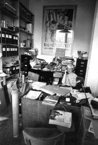
Andy in his office
— Photo by Mark Sink
About what time was this?
Mid-eighties. So I came alive again because I was immersed in the art community instead of doing catalogs of clothing. I was doing catalogs of artwork; shot a lot of Warhols. Shot a young artist that has just gone beyond the stratosphere, Jean-Michel Basquiat whose canvases are going for $50, $60 million. I shot his work for about six years. Most of the work you see online or anything, I photographed for him. We were friends. I didn’t have a very high opinion of him at the time, he was pretty drugged-up. I was part of the…well, I was the worker guy. I was the guy that came in to photograph stuff – ‘the help’. So, in the eighties, from the outside looking in, it was the Haves and the Have-nots, all the multi-millionaires and then all this talent and struggling artists and high rents, just like it is today. It’s this gigantic divide where you’ve either made it and you’re a gazillionaire, or you’re struggling – what I call ‘running up the down escalator’ [laughs] – one of my favorite sayings! I don’t seem to see as much of that anymore, people are super-lazy these days…kids are.
To what do you attribute that to? Is it the Digital Age?
That’s a lot of what I’m exploring with the show, ‘The Reality of Fiction’ [http://redlineart.org/art/events/exhibitions/reality-of-fiction.html/] over this disentachment from reality. We’ve sort of separated ourselves from reality; everyone has credit and has cars that are bigger than what they can afford to drive. They live in these fake over-extended houses and friendships on social media. You know, we’ve sort of just quietly stepped off into a process of, you know…don’t get me wrong, digital is genius and I use it constantly, but theres a crossover when people are trying to replicate a platinum print, you know, that gets into the Instagram thing. As long as it looks like the real thing, what does it matter? This sort of Disney fantasy effect is starting to take over and I think its embedded into kids getting lost in Facebook and video games; a sort of separation from reality. Even, for instance, wilderness photography that is shot on “nature farms”.
‘Nature farms’?
Oh yeah. The show ‘Nature’ owns a gazillion square miles up in Wyoming where they string out all the wires [with cameras] to follow the birds in flight. They have there little sectional studios for the beavers.
I had no idea they went to that extent.
It’s all staged. That’s what I’m saying, it’s putting real nature into a controlled environment. It’s like “How did they get into that den?”. You have to watch carefully. It’s like that series ‘Surviver Man’. You get the feeling that he’s out there barely existing but if you read the credits at the end it says something like, “Some scenes were re-created to give…”. Again, they’ll shoot some of the scenes in more of a controlled environment and cut them into the show later. So we’ve become more and more and more aware of this disentachment. You start to get this on your brain and you start watching out for whether things are being true to the medium or not and whether things are [built] honest with honest building materials. This house over here [points to the neighboring home across the alley], this rock, Italian villa we have over here – styrofoam. You can knock on it, it’s hollow “rock” [knocks on kitchen counter]. The strips that go around the window that look like solid concrete? The Mexican guys were putting these things on in the wind, they slap it on and bam, bam bam, they got it on and they stood back and you could see them go: “E-h e-h…it’s OK-ay” [laughs].
Probably not feeling much like real craftsmen?
No, but they [the owners] sold the place for $1.6 million.
Okay, so how does art bridge artiface? Is making an illusion of an illusion a valid art form?
Well, you can get into that philosophically, but it’s all illusion in photography, there’s no truth. If anyone tells you photography is fact – it’s not fact.
I read just recently that all photography is an opinion.
Well, theres a fantastic show at the Metropolitan Museum called Faking It [http://www.metmuseum.org/exhibitions/listings/2012/faking-it] showing how photography’s been faked since Daguerreotypes. It’s a long, long history of this sort of fantasized reality that photography’s been doing, which, in some ways, is why I’m struggling a little bit with going backwards. That’s why I love Polaroids, why I like Collodian Wet Plate. The light strikes the plate; what’s captured on that plate – that’s it. That’s BOOM, that’s it! There’s something really honest about that. And I like that…there’s something…anytime someone starts to f*ck with it, digitize it, or whatever you want to do with your photography, I don’t know. When it starts to get f*cked with; dabbing up those highlights, making those eyes a little brighter, da-da-da, cleaning out all the complexity, dabble, dabble, dabble…. You know, you can just feel it!
…stop being art?
Anything is art, I don’t think anything can stop it from being art. Art is what you say it is…anything can be art.
Is there a definition of art?
My definition of art is, uh-m-m…I forgot my definition of art! [laughs]No, it’s craft, craftsmanship. Creating and having a personal voice. Woodworkers are artists. A laborer who does a beautiful concrete job, I feel is beautiful art. But, if you don’t have that craft, everything drops off. But then there’s Damien Hirst who does the splosh, spin art. [laughs]
I left off with him during his bisected cow phase.
He’s a piece of work. He is a piece of work…
Can we quote you on that?
[laughs] Sure.
On that note – it’s on to MoP! The Month of Photography project is international, Denver has gained a lot of recognition and respect thanks to your efforts. What is the MoP story? When and where did it originate?
Well, I’ve always sort of naturally curated even before I knew what the word meant. I like getting groups of people together. I used to do it on the Internet, at least what I thought was the Internet with America Online in the early nineties. I was actually on America Online in the Kodak Photography Forum. I would gather a group of people and ask questions and then answer the questions just to start a conversation [laughs] within the fine art photography forum.
Just to get the ball rolling?
And it got rolling. People, well known photographers like Jock Sturges and a lot of very interesting people got aboard, so see, here I go off on these tangents…I’m so sorry, you’re going to have to do a lot of fast-forwarding to get…
That’s okay Mark, digital paper is cheap.
Okay, so I should say I’ve curated, I’ve done it on the Internet and curated art shows at school and, you know, that led to curating galleries. It’s kind of this power in numbers, gathering people to get together to put on events. I formed a group called The Denver Salon to show people’s artwork that I admired and brought them together. Once we had a group I would submit that to galleries in New York and museums in Aspen and the Denver Art Museum, and we got the shows. If I had submitted my work by myself, I never would have gotten a show. That’s what I meant by power in numbers.
So, we submitted together with our Internet group. We called it FAPB, Fine Art Photography Board, and a book was published on it, actually the history of it. We got the front page of the Arts Section of The Wall Street Journal. We were the first Internet art Show – it was called “Off The Highway” – where I got everyone together that was in this group. When it first started everyone was like BIG talkers. I would come and say, “I use a little toy camera!” and they’d be all, “What the f*ck?!” [laughs] I was like, “It doesn’t matter, it’s CONCEPT that matters.” And it was all [in deep, pretentious voice],“Naw, I use a Hassleblah, blah, blah…”You know, a lot of BIG TALKERS. And so I was like, okay, “Put your images where your mouth is…”.
So, in the Kodak forum was the Kodak Image Library where you could upload work, but there was no way to put it together in a folder, so it had to be organized by title. The title [file name prefix] had to have the name ‘Bob’. Bob Landscape, Bob whatever; so all the B’s – all the Bob [files] – would all come together. So it was the Bob Show. And that’s when I saw this work from people from all over the country and I was amazed. So I offered to do the Rule Gallery, a show for Robin Rule. We did the show and it got written up as: “HIGHWAY SHOW TAKES WRONG TURN” [laughs] Yeah, the critic didn’t like it. But we got wrote up in The Wall Street Journal.
How did that morph into MoP in Denver?
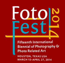
So, MoP again, is coordinating a group of people within photography. The inspiration comes from the Houston FotoFest which I started going to as a photographer to show and have my work reviewed at the Meeting Place [FotoFest’s portfolio review event]. Then I would go throughout the city to all the events at the FotoFest. The founders, Fred [Baldwin] and Wendy [Watriss] were inspired by a Month of Photography in Arles, France. That was the earliest, earliest one. So the Houston FotoFest is the monster, it’s huge. I became friends with them and started bringing their shows to Denver.
That was the inspiration for Denver?
Yeah, that’s where I got the inspiration that I could do this in Denver. I should do this in Denver. The Houston directors, Fred and Wendy, came out and they were very supportive. Their concept of having a portfolio review where everyone can show work with different themes and where galleries can become a part of that theme. Every year they’ll have a different one like Russia or China. This year is The Middle East. One year it was War, one year it was Mexican photography, another time it was Czech and Slovak photography. So, they’ve been doing it for a long, long time. They started in 1992. I have all their catalogs here. [Shows us beautifully printed Houston FotoFest catalogs from years past.] So, my mission is to eventually have a catalog like these for MoP Denver. We actually did a mini version of this for the Le Journal de la Photographie.
You were recently interviewed by them, correct?
Yeah. What’s neat is that you can get on their website and type in “MoP Denver” in the search box and all three pages will come up with everything we did for MoP Denver; The Big Picture and all the other stuff.
So, it almost sounds as if MoP is, I don’t want to say franchised, but people are picking it up in other cities.
There’s a lot of interest, yeah.
I came across a piece online in which Art News referred to the Denver art world very condescendingly. While the writer was very complimentary of the level of work coming from the local contributors to the MoP project, he/she seemed somewhat surprised that it was happening here— to use their phrase, “…they have emerged with great fortitude from a most unlikely place, Denver, Colorado.”
Yeah, that was an Art News quote on our Denver Salon group when we showed in New York City in the mid 90’s, ’98 maybe. It still hasn’t changed. LA, New Yorkers; we all do it, it’s human nature, like someone might say “Artwork in Austin?! Are there contemporary galleries in Austin?!” I have very educated, worldly, well known people who go, “You have a contemporary gallery in Denver?”. Honestly, I’m not saying that to be mean; they really think we’re still running cattle down the wooden sidewalks. You know, there’s just nothing really there between New York and LA, or Paris or Berlin.
Still, with the Internet it hasn’t faded at all?
Sure, we get some attention when a new wing goes up on the Denver Art Museum. There’s a newer generation out there that are a little hipper. We’re looked on as a close comparison to places like Seattle or Portland.
Not a bad way to be looked at.
It’s not bad at all, but we’re still not up there with the big boys. We’re still looked on as upstarts.
In recent years, we’ve seen a big jump in the popularity of wheat paste art. In its turn of the century heyday, it was used primarily as a carrier of advertising and political messages. Now we’re seeing the medium used almost exclusively for artistic purposes, from serious to whimsical themes and everything in between. How much, if any, has wheat pasting become the message as opposed to being the bearer of the message, as it relates to the artistic community? Is it simply another avenue for artists to exhibit, or do you think it inspires them to get out and shoot just for the purpose of wheat pasting?
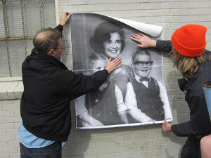
Wheatpasting the south side of the Reed Art & Imaging building on Federal Blvd.
Well, with the Internet, artists are more and more desperate than ever to be shown in a gallery. The idea of a gallery is even more exciting. You can post and post and post but to actually get your work in a gallery is even more intense than it was before. Your art is physically up on the wall. But the galleries are very hard to get into.
The validation factor of having one’s art in a gallery is even bigger post-Internet?
Yeah, probably, more so than in pre-Internet times. That’s a tough question.
This is probably a touchy thing to say around your company [Reed Art & Imaging], but I like the wheat paste thing because it’s free, you know? There’s no galleries, no money being exchanged. It’s back to that thing that I’m really attracted to; things that are really pure and honest. It’s a really pure form of inspiration and showing your work. There’s n-o-o money to be made, no galleries jacking prices up and paying artists. I get a big kick out of it and people really respond to it. There’s something there that really touches people when there’s no ads and stuff. That’s why when I push really hard for no big logos, people are like, [in manic, desperate voice] “WELL, HOW WILL PEOPLE FIND OUT WHERE I AM?!”. You have to be pretty lame not to be able to find information on it [MoP]. But that’s where I need to get better, we do need to have some way where people can go very easily and directly to the artist. In the future, we’ll probably do the whatchamacallit, the thing where you point your phone…
A QR code?
Right, but on the MoP sign, not on the artwork itself. I’d like to keep that sort of subtleness. Pretty soon, after awhile, people will start figuring it out and liking it, and knowing it – “Oh, that’s The Big Picture!”. You know, even now you type it in and it comes right to the top of Google.
You’re talking about building a brand, then?
Right. People will start figuring it out and liking it and seeing it.
Is ‘The BIG Picture’ a stand alone project, or is it an official part of MoP?
It’s stand alone and also married to MoP because I do it every MoP. It was conceived during and for the Month of Photography. We did a Big Picture book that didn’t have anything to do with MoP.
You own The BIG Picture and MoP; there’s no conflicting legalities between the two?
I’m MoP and I’m Big Picture [laughs]. I can sue myself .
How does all of this extend internationally?
The original concept that I wanted to do many years ago…I was going to get Epson or another sponsor to make big printouts and it was going to be a “mile long walk of photography” that would end up at some big center of photography like Red Line or whatever. It would be people submitting work from all over the world. And then I saw that a group had done something like this in subways where people would submit work. They’d send a digital file and it gets printed out and posted. So, that was floating in my head. Then an artist came and wheat-pasted the bathroom door in my gallery. She was doing wheat pastings as interior decorations. So I thought, “That’s c-o-o-o-l — I like that!”. So the idea of The Mile Walk came together with wheatpasting and that’s about the time JR, a French street artist– the guy that does the big faces all over the world – won the [2011] TED Prize. [http://en.wikipedia.org/wiki/JR_(artist)] So, all this was coming together all at once. So, I said, “Okay, we’re going to do an ‘out the door – out of the gallery – in the alley– down the street, thing.” So, we did a call for submissions to people all over the world.
It always gets a little touchy, the selection process. There were never any stated rules or judges listed or anything. The selection of work was basically at my discretion, I think that’s what people sort of accept. It’s been amazing the last few times we’ve done this – I don’t even like talking about it – I hope it kind of stays like this, but there aren’t contracts of release and re-use and publishing. You know you’re sending me this fairly high resolution file, we’re printing it in a book and doing this and that with it. So far, no one has questioned it and I really like that. I feel there’s a trust there. I’m sending out files, my favorite pieces of other artist’s work, to other cities, for them to put up in those cities. And much of it is heavily Denver-centric.
Everything has stayed at a friendly level?
So far, so good.
Are there any up and coming “Mark Sinks” in Denver, you know – artist/curator/patron…?
There’s a lot of people, a whole new Generation that’s springing up…but, let’s see… Adam Gildar, he did a great job with The Big Picture. He’s real go-go; takes on multiple projects. He started a group called Art Plant that gets studio spaces for artists. If he stays in Denver, he’ll be a major institution; he already is, actually. And there’s several others.
Do you think photography’s future is in good hands here in Denver?
Well, something that’s been rumbling around for awhile is that we need a photography center. A big one that could house the Colorado Center for Photography, that could house The Denver Darkroom. And I’m fearful of even using the word “photography”; “new media” is the best I can describe it at this point.
Can it get any bigger without you overworking yourself, and do you even want it to get bigger?
Well, that’s it, that’s what I’m struggling the most with in my own life. That’s what happened when I started my gallery. I thought I could do the gallery and put up a beautiful show and do my photography and be an artist. To do a successful gallery takes all of your time. My photography went into the toilet. Again, I was wilting like the New York thing, you know? Things would go good financially when I ran up the down escalator – crank up the media machine, the light bulb goes on, the critics come and everything happens – but as soon you slack off, [makes dying engine noise] whir-r-r-r-r, people stop coming in.
Mark Sink, June 2013
— Photo by Greg Osborne
What do you do then, hire on more help?
Well you hire on salespeople and you have this, like, used car salesman person, that I just don’t like. You know they can sell, but that whole thing of them standing there [shudders]. I mean, they could sell, but I just couldn’t stand listening to them making contact calls, you know? It would just make my skin crawl. Going on and on; I’d end up taking the phone away from them [in overly-apologetic cartoon voice] “Sorry, I have this obnoxious salesman working here…”. If I left him on the phone he would probably make sale. So, I struggled with all that. If I did it again it would probably be non-profit, like The Center for Photography where you get corporate support. I have a lot better time of it when I’m pitching something I’m really passionate about. Every corporation in Denver has to dump money for tax write offs at the end of the year, so if you can spark an interest, you’re in.
So, to wind it up, how do you see Mark Sink and MoP in the future?
MoP? I like it the way it is, [laughs] I know how much I can do. I know what the saturation point, the workload is, and I know that more galleries want to join in, so I feel comfortable with that, and there will be fine tuning. I need to form a board with it, it needs to go 5013c. Right now, it’s sheltered by RedLine. But I am struggling with that growth, I like it where it is right now [laughs] it’s big enough!
![By SharkD (Own work) [GFDL (http://www.gnu.org/copyleft/fdl.html) or CC-BY-SA-3.0-2.5-2.0-1.0 (http://creativecommons.org/licenses/by-sa/3.0)], via Wikimedia Commons](https://upload.wikimedia.org/wikipedia/commons/a/af/RGB_color_solid_cube.png)