Raw Versus JPEG – What They’re Not Telling You

In the ever-present quest for perfection, photographers from around the country call me weekly with questions about shooting raw versus jpeg. The debate over this topic has been waging strong on the internet since the advent of digital still-image capture. Creating confusion, every photo blogger and “expert” in the forums has their opinions. Each of them expressing “this is the right choice”.  Well today’s post is here to proclaim that it’s mostly bunk. There is no perfect answer that fits every photographer all of the time. The Holy Grail of file type is a myth and it’s time to stop looking for it and get on with the business of taking great images. The two camps in the JPEG versus RAW debate have strong emotional bonds to their “rightness” and are willing to go to great lengths – even as far as to embarrass themselves online while attempting to change the unchangeable minds of the opposing camp. They cling to the strategy of looking for evidence to support their case while ignoring the evidence of the other. In the end it just adds up to more confusion for the reader – who continues to be un-prepared to make their decision. If you are hoping this post will give you the right and perfect set-it-and-forget-it-forever options, you won’t find them, because I don’t think they exist – though you may find one that works for you most of the time. What you will find is unbiased data to help you make educated decisions before you enter a shooting scenario. You will also find enough data to see clearly why I made my bold statements against the “This is always the right way” mentalities.

Let’s get down to business
If you are a professional shooter, regardless of market you will likely have some of the following example criteria to consider as part of your decision making process:

    • On what standards do your customersdetermine quality of service?
      • How important is color accuracy?
      • How critical is the pixel depth (megapixels)?
      • Is dynamic range an issue?
      • What are your expected turn times from capture to delivery?
    • Technical issues
      • Are you shooting under controlled lighting and can control scene dynamic range?
      • What is the expected use of the image?  Web, press, photographic, pigment, all of them?
      • How large will the file be expected to print?
      • Do you have time for custom white balance?
      • Do you have time to verify exposure settings with a quality hand-held meter?
    • Business related
      • Do you see time as money?
      • Are you paying assistants or digital artists to post-process?
      • Are you paying your lab to color correct for you?
      • What is your present customer satisfaction rate and is there room for improvement?
      • Are you willing to spend some time, effort, and resources to impact product quality?
      • Do you expect your workflow to minimize the post-process impact on margins?

If you are a hobbyist, what are you looking to gain?

  • The best possible print.
  • To spend more time with family and less time with post-processing
  • To gain more control over the final image
  • To fit more images on the limited space of a card
  • Technical questions:
    • What is the subject matter?
    • Under what conditions am I shooting?
    • How will the image be used?
    • What is your personal criteria for quality?

Perspectives – it’s all a point of view
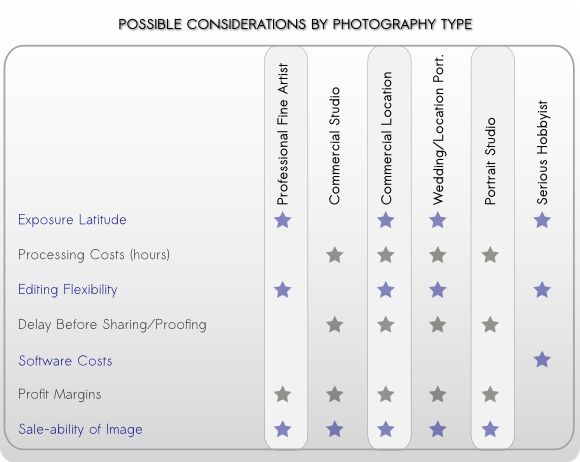
Before choosing your shooting format I recommend you first determine your priorities and make a list. When you know what is important to you, then the best choices can be made and most often with higher levels of confidence. For these examples, we’ll look at the typical requirements of each shooter type. Knowing the requirements will lead to understanding why a certain thing might be a priority. Photographers and business models vary, so results and opinions may differ. For the pro, they have to satisfy an end user in order to make a living. Often working with pro level tools to maximize image quality and speed the process. For some of the professional markets such as studios, time is an expense against the profit margin and customer experience may have the largest impact. For other business models such as fine art, it’s often maximum image quality that is the primary target. Studios are the business model most likely operating in some type of assembly-line type of workflow. They have dozens of images from each person or product shot and each of these files needs some kind of attention. Usually starting with elimination of the unusable, then selection of the prime images followed by editing. The artists that are paid to handle this process are usually compensated by the hour. The longer it takes to move a job through the work-flow, the deeper the cut into the bottom line. Quality needs to be maintained to meet or exceed the customer’s minimum expectations. The average consumer’s expectations are often that the professional print should exceed the quality of a drug-store print. As long as they can see a higher level print, that particular expectation is met (photographic skills such as composition aside for the intent of this discussion).  Skin-tones and most all other colors related to people photography fit will inside the sRGB colorspace. Studios have a great deal of control over their lighting, and thus the required dynamic range for the shoot. A good setup can usually hold within a 6 stop limitation of a JPEG work-flow. Interior location photography has additional challenges resulting from ambient conditions that might not be controllable. Office lighting, large windows, etc. can contribute to the overall lighting of a scene and may result in lighting ratios that exceed the 6 stop limit. In profit-centric people photography, merging brackets for HDR is rarely an ideal solution.

Commercial product photography has unique demands, especially when the product or person being photographed requires special staging and effects.
And yet the images themselves usually end up being used in the lowest of gamut conditions: 4-color press and the internet. In a complex shoot, where lighting, effects such as smoke or movement are in play, bracketing is not an option so maximum dynamic range is beneficial.  In table top product photography – think catalog photos – there is no movement, lighting is completely controllable and product colors rarely exceed the basic gamuts of Adobe1998 or sRGB. Since the subject does not move, bracketing can be used to maximize dynamic range.. Food photography brings the potential for highly saturated colors that would do well with a larger gamut and maximum control.  A commercial photo session often includes a day or more of styling, prep and active capture, followed by a similar amount of time in post. There are thousands if not ten’s of thousands of dollars at stake and final image quality can be critical to the customer’s end sales. Such diversity creates situations where JPEG would be most profitable and other times where a RAW work-flow is mandated.   The fine-art photographer is often most concerned with image quality. They seek an integrity in the image that jpeg does not deliver. Maximum dynamic range, sharpness, color fidelity and detail are all sought in the persute of the ideal print that meets the artist’s vision and the expectations of the descriminating print buyer. Fine art images are often heavily manipulated to create the mood sought by the artist and to bring out maximum detail. Through manipulation, detail along with any compression artifacts will also be brought to greater light. Artists will often use improper white balance to enhance mood and emotional response. The artist will often spend countless hours laboring over pre-planning of a shoot, and many financial resources are spent on models and assistants. The final editing is usually performed by the photographer rather than an assistant.

Pick a card, any card…
Prepared with the insights you now have into the requirements of a few professional photographer types, these charts should help clarify why one format type won’t properly cover every photographer’s needs, and how some photographer’s might benefit from both types during their day.
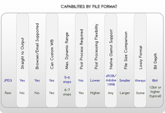
Jpeg Versus Raw, Capabilities by File Format Type

Basic Pros and Cons
Pros Cons
Raw
  • Can be any working space you have a profile for.
  • WB can be tuned post-capture.
  • Greater exposure latitude – though precise exposure is recommended.
  • Highest level of adjustment flexibility before causing gaps in histogram.
  • Best option if over-sampling is required.
  • Supported by Pro-level software
  • Non-lossy raw formats contain highest levels of color-fidelity
  • Takes the more time and resources to post process.
  • Larger in-camera and offline storage space requirements.
  • Must be processed before online sharing/distribution can occur.
  • Must be processed prior to printing
  • Additional software required.
  • Not supported by all editing software
Jpeg
  • Smaller file sizes maximize in-camera and offline storage space.
  • Proper WB and exposure can often go directly to print.
  • Easily shared via email and web with no additional work.
  • Lower time investments.
  • No additional software required.
  • Maximum software support both pro and consumer level.
  • Usually limited to sRGB or Adobe1998 at time of capture.
  • Any settings applied in camera i.e. WB, sharpening, noise reduction, etc. are “fixed” into the image – changes require post-capture retouching/editing.
  • Minimal exposure latitude of 1/8 stop.
  • Lossy format means you paid for resolution that you are sacrificing.
  • Typically does not over-sample well due to in-camera sharpening and compression related artifacts.

 Jpeg Versus Raw, Considerations by Photo Type

A successful photographer will learn the needs and expectations of their client, then support those needs through technical and artistic know-how, all the while minding the needs of the bottom line.

You can help our readers by sharing tidbits you have discovered regarding JPEG and Raw workflows in the comments below. And as always, we are here to answer your questions.

Giclee Fine Art Printing – Getting a Great Print Part 1 – Photography of Artwork

A Pigment print is a bit more than just an inkjet print. So what makes it fine art worthy? To qualify, the print must be achieved using archival grade pigmented inks on archival grade fine-art paper or canvas. While we love the look of the watercolor papers and canvas papers we don’t suggest using Giclee “photo papers”. For aesthetic reasons, we recommend that the artist get a fine art photographic print for that. But the quality of the fine art pigment print is not limited to the inks and papers you use. There is quite a bit more that goes into the craftsmanship than just the print alone.

There is a great many details that should be tended to, but the major areas can be broken down like this:

Photography of your artwork
Working the file before testing
Generating a worthy test print
Working the file again to refine the proof
Printing the final units or series

Each of these is important to understand so they may become an effective part of your workflow. Since there is a great deal of information to pass along,  I’ll split the content into a multi-part series.

Photography of art work

Every step in the production chain of your fine art edition is critical, but some steps, if improperly done, can be disastrous to the final viewer experience. The first step, photography of your artwork, is an excellent example. This step is the largest determining factor to the faithful reproduction of your original art. To create a great pigment print, the photography of the artwork should be:

  • Focused properly using high-end lenses
  • shot using a strudy tripod in a vibration free environment
  • photographed using the sweet-spot of the lens
  • in some cases, polarized light and or special lens filters may be required
  • exposed correctly with a critical attention to detail
  • evenly lit using the proper lights
  • correctly white balanced
  • shot in the proper file format and with sufficient resolution
  • shot in a colorspace that is large enough to capture the full range of the painting and supports the full range of the Pigment print

The right glass

Shooting with inferior lenses may result in various distortions, such as smearing around the edges, chromatic aberrations – where some colors focus differently than others, barrel or pin-cushion distortion, lens flares and overall lack of saturation and/or contrast.  Shooting with prime lenses and pro-level equipment will provide the highest possible image integrity and result in a file that achieves the closest honesty to the original.

Image courtesy of https://upload.wikimedia.org/wikipedia/commons/thumb/4/47/Lens6a.svg/200px-Lens6a.svg.png

Chromatic aberrations of cheaper lenses result in out of focus images with color fringing.

Image courtesy of https://upload.wikimedia.org/wikipedia/commons/thumb/9/91/Apochromat.svg/200px-Apochromat.svg.png

Proper apo-chromatic focus results in all wavelengths (colors) focusing on the same plane for maximum sharpness and detail.


Image courtesy of https://upload.wikimedia.org/wikipedia/commons/6/66/Chromatic_aberration_%28comparison%29.jpg

Bottom photo clearly shows effect of apo-chromatic aberrations.

Distortions, or bending of the image are another issue with lesser quality lenses with “pincushion” and “barrel” being the most common. Pincushion distortion has the effect of the center of the image being further away than the edges while barrel distortion is just the opposite. With barrel distortion, the center of the image appears closer to the viewer than the edges.

Image courtesy of https://upload.wikimedia.org/wikipedia/commons/thumb/5/5b/Pincushion_distortion.svg/200px-Pincushion_distortion.svg.png

Pincushion distortion created converging lines towards the center of the image

Image courtesy of https://upload.wikimedia.org/wikipedia/commons/thumb/6/63/Barrel_distortion.svg/200px-Barrel_distortion.svg.png

Barrel distortion creates diverging line near the center of the image


A quality image capture is not dependent exclusively on a good camera/lens combination.

A high quality pro level tripod is a must for the artist who is serious about photography of art

A high quality pro level tripod is a must for the artist who is serious about photography of art, and they are expensive.

All elements in the photographic process are important. For example: how the camera and art work are handled during the exposure process will add a measurable difference to the final product.

A good solid vibration free tripod is a must-have if you are serious about photographing your own work.  Any vibration in the camera or the original artwork during exposure will result in “motion-blur” that will visibly carry over to your reproduction prints. While lesser tripods may be appealing just because of their price, they are susceptible to vibration, “ringing”, sagging and slipping during exposure. Think of it this way, if cheapo gear would lead to professional results, then why would there be a need for “pro” gear, and why would the pros invest the top grade gear?

If you want to get the best looking print, and your are committed to doing your own photography of your art do yourself and your art buyers a big favor and use the gear that will get you fine art quality instead of drugstore quality.

A stable support for your artwork is equally important. Any movement in your art during exposure will result in motion blur issues that will leave the image looking out of focus or double-exposed. While it may be tempting to take your art outdoors for the photo session, keep in mind that your painting is much like a sail in the wind. The slightest breeze will result in movement in the artwork. Heavier breezes or gusts may damage your art. And shooting with only one light-source, such as the sun, does not provide even lighting across the entire painting. I know this sounds crazy, but it has to do with what is called “angle of reflection” This is basically a measurement of the angle the light-path takes as it reflects away from the subject towards the viewer or camera and it is always equal to the angle of incidence (the angle the light path takes to get to the subject).

The propensity of light falling on a subject will reflect away at an angle equal to that of it's source.

The propensity of light falling on a subject will reflect away at an angle equal to that of it’s source.

Light falling on your canvas is more likely to scatter in a direction away from the light source. So let’s take the example to the right. The light source, in this case the sun, is to the left of the painting and the camera is directly in front of it. As we move across the canvas from left to right, we have less light reflecting in the direction of the camera lens. This results in the right side appearing darker than the left. This is called “fall-off”. Our eyes and brains adjust for fall-off for us, so we tend not to see it with the naked eye. While much of the light will “scatter” off in multitudes of directions, it is not enough to eliminate fall-off.

Since our light source is high and to the left of the subject, the brightest area will also be high and to the left.

Since our light source is high and to the left of the subject, the brightest area will also be high and to the left.


Shooting indoors gives you the greatest control over your environment for lighting and stability. When possible, setup your tripod on a concrete floor. Wood floors have flex and tend to amplify vibrations like a spring-board. If you must setup on a wooden floor, try to locate the load bearing supports under the floor and set your tripod in that area to minimize vibration. The farther you are away from the supports, the more amplified the vibrations.

Stay tuned for the next post in the series on Proper Lighting and Exposure. You can subscribe to our newsletter or via RSS to be notified automatically.


How to Setup Your Digital Files

We want you to have the best possible photographic print or fine art reproduction with the least amount of difficulty. For an engaging experience with outstanding results, simply follow the instructions below!

Recommended Working Color Spaces

While we suggest that you convert to profile for all large format prints (LightJet and Giclee Pigment Prints) we provide you the freedom to submit your files in any color space you prefer. The table below shows our recommended working spaces.

GicleeLarge Format Photo (LightJet prints up to 49x120)Enlargements and Proofs (Frontier prints up to 12x18)
Recommended Working Color SpaceAdobe 1998 or sRGBAdobe 1998 or sRGBsRGB

A note on filenames

  • File names must have the appropriate .tif or .jpg extension and must not contain characters such as: \ / :*?”|’~ $ spaces right before the period, bullets or foreign characters.

Monitor Calibration and Color Profiles

  • Let’s start with how you see your digital files. Every monitor is different and changes over time. It’s important to keep your monitor calibrated and as close to output reality as possible. The purchase of a quality colorimeter is a good investment.
  • We calibrate our production displays using the X-Rite i1 Display 2 colorimeter. Our monitors are set to a gamma of 2.2 and a color temperature of 6500k. We use Daylight balanced (5000k) illumination for color assessment unless you request otherwise. This excludes backlit trans, which use an industry standard of cool-white.
  • The best prints come from the best digital files. No amount of profiling will accurately compensate for poor exposure, over-worked corrections or inaccurate color. Profiles merely help with attaining a print that is truer to the actual content of the file. We strongly recommend using a properly calibrated display with the correct working space/output profile combination for a given printer or device. If you want to learn more: Color calibration information is available by clicking here.

Turnaround

  • All instructions must be written legibly, verbal instructions will not be exclusively accepted. When supplying a file for output, job turn around times begin on the first business day when we have received all required elements to complete the job.
  •  Compress (zip archive) your fonts if you are uploading your files, or convert your text to outlines.

Please include:

  • All screen and printer fonts
  • Linked files
  • A hard copy layout with a color reference if applicable. For uploaded files, please include a client approved PDF.
  • Provide images in the proper color space as listed for each device.
  • Lightjet – converted to our output profile, or in a working space such as Adobe 1998 or sRGB
  • Failure to properly set-up and include all necessary files MAY DELAY YOUR JOB! Any production time required to correct set-up errors, improper color-space, incorrect file type, proportions etc, may result in intervention charges billed at a $60 set-up fee, plus applicable hourly rates. All output pricing is based on the size required to print all data in your layout, including crop-marks, registration marks and bleed. Because we use a multi-platform network, it is imperative that file names be fully cross-platform compatible; no punctuation or extended characters such as bullets, trademark, slashes, dollar signs, commas, etc. Hyphens and underscores are acceptable.

Programs

Our Fuji-Frontier Mini-lab only accepts .jpg and .tif RGB files (sRGB is preferred for the most predictable color). Layout files and or PDF are not printable on this device. Please convert your files to .jpg or .tif before submitting for small format printing.

For large format printing, we accept files from the most current versions of the most popular professional graphics and layout programs listed below. If you are using a different program for your work please give us a call.

Adobe In-Design

  • .native, .eps, .pdf
  • RGB preferred
  • Please convert all text to outlines
  • All screen and printer fonts
  • Linked files
  • A hard copy layout with a color reference if applicable. For uploaded files, please include a client approved PDF.
  • Provide images in the proper color space as listed for each device.
  • Whenever possible, prepare your layout to final size of output.
  • If full size is not an option, please use a scaling of 50% or 25% .
  • If bleed is not included within the document area then it will not be printed.
  • If there is no bleed included, we will usually enlarge the print slightly to accommodate mounting.
  • Please inform us of the final document print size, so the job is not delayed while we contact you for that information.

Adobe Illustrator

  • .native, .eps, .pdf
  • RGB preferred
  • Please convert all text to outlines
  • All screen and printer fonts
  • Linked files
  • A hard copy layout with a color reference if applicable. For uploaded files, please include a client approved PDF.
  • Provide images in the proper color space as listed for each device.
  • Whenever possible, prepare your layout to final size of output.
  • If full size is not an option, please use a scaling of 50% or 25% .
  • If bleed is not included within the document area then it will not be printed.
  • If there is no bleed included, we will usually enlarge the print slightly to accommodate mounting.
  • Please inform us of the final document print size, so the job is not delayed while we contact you for that information.

Adobe Photoshop

  • Flattened, uncompressed tiff or max quality jpg.
  • Adobe 1998 or sRGB.
  • We reccomend converting to our profiles when applicable
  • Provide images in the proper color space as listed for each device.

Microsoft PowerPoint

QuarkXPress

  • .native, .eps, .pdf
  • RGB preferred
  • Please convert all text to outlines
  • All screen and printer fonts
  • Linked files
  • A hard copy layout with a color reference if applicable. For uploaded files, please include a client approved PDF.
  • Provide images in the proper color space as listed for each device.
  • Whenever possible, prepare your layout to final size of output.
  • If full size is not an option, please use a scaling of 50% or 25% .
  • If bleed is not included within the document area then it will not be printed.
  • If there is no bleed included, we will usually enlarge the print slightly to accommodate mounting.
  • Please inform us of the final document print size, so the job is not delayed while we contact you for that information.

Fonts

  • All screen fonts and printer fonts must be included or text converted to outlines.
  • DO NOT use keyboard commands for bold or italic fonts.
  • Use actual bold or italic fonts where applicable.

Layout

  • Whenever possible, prepare your layout to final size of output.
  • If full size is not an option, please use a scaling of 50% or 25% .
  • If bleed is not included within the document area then it will not be printed.
  • If there is no bleed included, we will usually enlarge the print slightly to accommodate mounting.
  • Please inform us of the final document print size, so the job is not delayed while we contact you for that information.

Color

  • All efforts will be made to approximate to your supplied color samples, however, due to the limitations of the different media, we cannot guarantee an exact match.
  • Color corrections that require more than global corrections will incur retouching charges. Items that we scan may require billable retouching time to match an original.
  • If a test must be approved before finals are hit, the finals will have normal turn around times, beginning from the time of approval for color.
  • If Pantone or process color matches are requested, we recommend calling so we can give you the closest equivalent color build for a given media.
  • All devices print differently, and different media on the same device may not produce the same results. An image corrected for one media may require additional retouching time to correct the image for another media.
  • Images supplied by the customer will be charged computer time to match color to a proof.
  • Remember, what you see on your monitor for color is not always a good indication of how the final print will look.

Proofs

  • If a proof is required, it will be done on the same device and media as the final print.
  • The proof will be the full image, printed to an 8″x10″.
  • If a strip test is requested at final size, there will be an additional charge applied.
  • If you require a proof after layout adjustments ie: text changes, image placement etc., we can email a PDF. If the files exceed 50 megabytes, we may print a screen capture of the layout. We will e-mail a PDF or screen capture free of charge.

Removable Media

We accept the following removable media:

  • CD-ROM/ DVD
  • Thumbdrive
  • Micro storage cards
  • You may also send you files via our web upload page.

LightJet – large format photo prints

LightJet Calibration Specifications and Profiles are available by clicking here.
Files submitted for LightJet output must be supplied:

  • In an RGB color-space
  • As non-compressed, flattened tiffs or maximum quality jpeg – no layered files.
  • Use of our profiles is highly recommended but not required.
  • At a minimum resolution of 150 ppi at 100% of final size.
  • For prints smaller than 20×24 it is recommended that the resolution of the file be closer to, but not to exceed 300 ppi. and rely less on the LightJet’s superior built-in interpolation.
  • The LightJet’s maximum resolution in normal mode is 300 dpi. For large prints from lower resolution files, we rely on the lightjet’s internal interpolation algorithms to achieve that final resolution.

Giclee Pigment on Canvas and Watercolor

  • The Pigment printers will print up to a 60 x 120 inch image area on a maximum paper size of 60 inches wide.
  • Watercolor paper or canvas,
  • Raster Images should be supplied at a minimum resolution of 200 ppi at 100% of output size as RGB TIFF- Adobe 1998 or sRGB.

Fuji Frontier Mini Printer for prints up to 12×18

The Fuji Frontier Digital Photo Printing Minilab accepts files in the following formats:

  • sRGB 8-Bit Tiff (no LZW)
  • sRGB 8-Bit Jpeg
  • Greyscale 8-Bit Tiff (no LZW)
  • Greyscale 8-Bit Jpeg
  • File names must have the appropriate .tif or .jpg extension and must not contain characters such as: \ / :*?”|’~ $ spaces right before the period, bullets or foreign characters.

How to Get Great Color, Save Profits, and Never Have to Work Color or Density in Photoshop or Lightroom. Part 1

I’m going to fill you in on the secrets of how to get great color, save your
profits, and never have to work color or density in Photoshop. All without
the use of ICC profiles, confusing work-flows or batch conversions.
If you understood the above and it applies to you, chances are you are a
professional photographer. Professional print quality is much easier to achieve
than most photographers are aware.

Getting there requires Five crucial elements. With these five in place, you can go
directly from camera to print and get excellent results.

Yes, that’s right, higher profits and more free time with:
No Photoshop work.
No profiling magic.
No bag of tricks or fairy dust.

Rule #1 – If you have to adjust the density of your files, your metering is inaccurate.
You may find this hard to believe, but truly consistent spot-on exposures rarely come
from TTL metering. I know that’s tough to swallow, but reflective metering is just too fallible.

Don’t believe me? Here is a simple test to see if this rule applies to you.
1. Take a look at the average corrections you are making on your files in
Photoshop or Lightroom.
2. Jot down the number of exposure corrections you make in a work week.
3. If the answer is any higher than zero, guess what, I’m right – your TTL has failed you. So how do we correct this?
Get a GOOD new or used hand held incident flash meter, and calibrate it to your
camera using Will Crockett’s “Face mask Histogram Technique” copy and paste
the following web address into your browser: Go to
http://www.shootsmarter.com/index.php?option=com_content&task=view&id=116&acat=16
Keep in mind that digital cameras have only 1/8th stop of exposure latitude. If you
have an incident meter, compare it against Will’s meter reviews and see how it rates. Some
well known meters are unprofessionally inconsistent . Up to a horrible deviation of +- 1/3 stop from reading to reading. This is definitely outside of the acceptable range for a professional photographer and enough to put you back in an editing app to tweak density.

After you have calibrated your meter to your camera using the Face Mask Histogram, you have completed the first of a few simple steps towards a more efficient and predictable workflow. Take some test shots this week and fine tune your exposure calibrations to ensure you are keeping your highlight detail while maintaining good shadow detail.
Next time:
Part 2.

How to get Great Color, Save Your Profits, and Never Have to Work Color or Density in Photoshop. Part 2

My last blog post discussed the weakness of TTL metering and the need for spot on exposure to avoid working your files in photoshop. Thus saving money and time which should result in a more profitable business.

Rule #2 – If you don’t have proper white balance, you don’t have correct color.
This seems like a real “DUH!” statement, but it is astonishing how many pro’s still don’t grasp the importance of this.
Using auto white balance in a high-end professional workflow is a bad idea? Auto WB works if you have absolute
neutrals in your image, and even then it can be fooled by bright or near neutral tones in your subjects. If you are not getting consistent skin tones from sitting to sitting, or indoor to outdoor it’s time to adopt custom WB in your capture work-flow. And you wouldn’t dream of passing these auto white balance inconsistencies on to your final client prints – right?
The brief amount of time it takes to get an accurate custom white balance by using an accurate target can, and likely will, save your studio hours of Photoshop time.
And I am sure you know that in a pro studio:
Hours = (Profit – Dollars + extra time you could be getting more business).
And if you are paying staff to deal with exposure and white balance issues, don’t forget to add in payroll taxes and benefits to that equation. With accurate white balance control, you will NOT need to adjust the color of your files. Assuming of course that your camera is in a good state of repair. It is rare that the preset white balances on your camera will be accurate enough for professional standards.

To get an accurate WB, you need an accurate target.
If you are using a Kodak Grey card or one of those black/white/gray targets or a plastic over-the-lens diffuser, I would invite you to upgrade to something more accurate. If quality and/or profit margin are your #1 concerns; above all else get the most accurate WB target available. The Balance Smarter from the smart folks at BalanceSmarter.com.
Your color is only as good as the WB target you use. If you skimp here, you’ll pay the price later in additional work or reprints. Is it worth the risk?. After spending thousands on education, good gear and marketing to get business, seems a shame to put the investment and your reputation all on the line using a cheapo calibration target or tool.

If you are still tempted to take shortcuts during the shoot, every time you have the thought ” I’ll just fix it in Photoshop later”, say to yourself instead:
” I’ll just spend the time and money to fix it in Photoshop later”
Be Honest, isn’t the latter REALLY what you would be doing?

Next week:
Rule #3 – Using the right colorspace = great prints!

How to Get Great Color, Save Your Profits, and Never Have to Work Color or Density in Photoshop. Part 3

My last two blog posts discussed the critical need for spot-on metering and absolute correct white balance to avoid working your files in photoshop. Thus saving money and time which should result in better prints and a more profitable business.

Rule #3 – correct working space + Printer space = Great Print!
Digital cameras work extremely well in the sRGB space, and coincidentally, the Fuji Frontier/Noritsu printers of the world are designed to work within that space. Hmmmm, wonder why that would be….

Straight up – an sRGB work flow is your direct channel to go from camera to print. Shooting in Adobe1998 will not gain you any tonal range in the file. Both color spaces have the same levels per channel limit. And this is based on your camera’s bit depth, not your choice of working color space. Neither will any get whiter than 255, 255, 255 and neither will get any darker than 0,0,0.
You have black to white and the same number of levels in both. The gains are in the number of available colors. The larger the space the more colors. Typically these relate to high saturation colors that don’t often show up in most scenes.

These benefits of specific color spaces come into play on the output. Shooting in a color space that does not approximate that of your output device can lead to unpredictable color unless you are willing to spend the time converting to the output profile via a color managed workflow. That step can be sped up using batch processing, Remember, the goal here is to reduce your work load and still get a great print –  right?  Supplying a file to your printer in a mis-matched color space can result in saturation, contrast and color issues that will require intervention to get a good print. Again; Intervention = additional cost.

If you are shooting portraits and weddings, the largest percentage of your work prints 12×18 or smaller right? This means they go to our Fuji Frontier for printing on professional paper.
When  your work is more along the lines of fine-art, we strongly recommend a properly color managed work-flow that includes the use of output profiles. Your takeaway: Shoot in sRGB when printing to sRGB type devices. When printing to higher gamut devices, or when in doubt, shoot Adobe 1998 and convert to the output profiles.

Using the steps described in this series so far, you are well on your way to a slimmer, faster and more profitable work-flow. Barring any need for retouching, you should be able to go straight from camera to output and get a fantastic print.  Give it a try and let us know how it worked out for you.

Next week: Part 4. Picking the file format.

How to Get Great Color, Save Your Profits, and Never Have to Work Color or Density in Photoshop. Part 4

In the previous post in this series, I wrote about using sRGB for printing your studio work.
This post we talk about how JPEG can be your workflow friend.

Rule #4 – JPEG has benefits.
Shooting raw has its place. Like when the dynamic range of the scene far exceeds that of your camera. Or when you need to really fine-tune an image. But-if you are shooting raw because you aren’t getting good results in-camera with jpeg, please re-visit rules 1, 2, and 3. If you get the first three crucial elements in place, you won’t need raw for your portrait and senior work. Shooting in JPEG eliminates the steps required to convert from camera raw. If your image sensors are clean, and you have all the other elements in place you can send your files direct for printing/proofing without any further work, barring retouch or enhancements of course. This process may not be ideal for fine-art or landscape shooters, but it can be ideal for portrait and wedding shooters.

If you choose to shoot JPEG files, set your camera for maximum size files and the largest pixel dimensions. And be careful with just how much sharpening you allow the camera to apply. Too much sharpening and you might get too much pore detail on the closeups. Too little and the image will of course look soft. Excessive sharpening also limits just how large you can print the file before the sharpening artifacts become painfully obvious. Spend a little time testing now, and you’ll have the confidence to know later that your files will look great right out of the camera.

Rule #5 – Print on quality photographic paper.
This means professional paper. Not the over contrasty, over saturated non-neutral stuff you get from drug stores, discount marts, warehouse/membership stores. This means use a good pro lab. Not Costco, not Wal Mart, not Walgreens, not Drug Emporium, etc etc etc.

The papers you get from consumer mini-labs are purposely manufactured to NOT have accurate color. Yep, they make it screwy on purpose. You see, Joe Consumer likes prints with colors that aren’t real. They want false saturation and contrast for that extra snap. In most cases, their photos benefit from that assistance to help the snap-shot look a bit more appealing to the eye.

Professional paper is manufactured to very exacting standards to achieve neutral balance, correct saturation and excellent skin tones. Pro papers will handle extra saturation if you really need it for your “look”, so add it if you wish, but at least you have the option. And get this, just by using pro papers, you get an additional stop of shadow detail! That’s right, you get deeper blacks with pro papers. This means you can actually get a snappier looking print and hold shadow detail when your files are setup correctly.  A properly exposed, correctly white balanced image with great composition that is printed on professional photographic paper won’t need the artificial extra punch to compensate.


So there you have it, the keys to establishing a profitable and expedient workflow.

  1. For spot-on exposure and excellent detail use a professional incident meter, not TTL
  2. Perfect color comes from accurate white balance using a high-end accurate digital-ready target
  3. Using a colorspace that most closely matches your output device will speed up workflow and minimize color shifts
  4. For the studio, JPEG files will expedite your production and get you to print faster
  5. The most accurate color and deepest tonal ranges come from printing on professional papers.

We would love to hear how this all works out for you. Do you have other workflow tips you would like to share? Post them in the comments section.

Making Videos While Stressing Less and Sleeping More

Once I have my subjects signed up and ready for the shoot, I like to make the most of the opportunity. I plan on at least 30 minutes to one hour on-site. I get as much footage as possible so that I can edit to my hearts content and maybe even get enough for TWO videos. If you have interesting subject matter and talent that feels comfortable in front of the camera, you may have a multi-part series. If your subject is comfortable and keeps on talking….keep on shooting. You never know what jewels you can come up with.

Schedule More Than One Subject Per Day
I find that when I am in my groove and setup for shooting, I can get alot done in one day. I try to schedule more than one subject per day. This allows me to focus on shooting when I’m shooting and editing when I’m editing. Same thing for creating the music in Garage Band.

Setup Private Viewing on YouTube
I upload my videos to YouTube but don’t let them go public until I am ready. Once they have been uploaded, I can take them public anytime I want. So if you want your video to go live on the 15th of the month, change your settings and go live on the 15th. It’s just that easy.

If you have questions or suggestions, please leave me a comment.

Next Time: Making Music in Garage Band

Getting the Best Possible Print from Your Fine Art Lab. Part 5 of 5

Getting to Know You!

Get to know the people who print your work.
A true fine-art class facility doesn’t just work for you, they work WITH you to get the print that satisfies your vision. Only you as the artist know exactly what you want in your print. Good communication skills can bridge a tremendous physical distance and result in a great print. Your master printer wants to know what you want in the print.

Testing is a critical step of this communication process.
Once a physical test has been printed, tangible suggestions can be made for changes. Get to know the lingo and the processes involved. The more you know, the more accuracy in your printer to artist communications and the less frustration has an opportunity to creep into your experiences.

Be open to hearing suggestions.
The printing technician is aware that this is your art. It’s your baby and your vision. The last thing they want to do is tread on that. Remember, they are here to print WITH you. The tech has likely printed countless thousands of fine art prints in their career and may have some truly outstanding suggestions that can elevate the print to unexpected regions. If you are willing to try their suggestions let them know that after seeing the results there is a possibility that you may want to go back to where you were. Then, if you don’t like the results, they will have been forwarned and thus prepared the files in such a way as to ensure a smooth transition back to the start.

You deserve a Great Print!
The countless hours spent by the artist from the time of exposure to the final print deserves to be rewarded. Hitting all the key points addressed in this series should bring the gift of an easier journey to a great print. If you partner your fine-tuned image file with a printer who understands how to elevate a file to a fine art print, your efforts will see even greater rewards. Sure you can still send your file to costco, or some mass production facility specializing in carnival prints, but where is the reward in that?

Creating Videos for YouTube

In this post, I’ll go over the equipment and software you need to get started.

I’m a graphic designer at Reed Photo Art. Among other things, I design and publish our e-newsletter and create our YouTube videos used in our social networking. So far, all of my work has been done on a 17” MacBook Pro running Mac OSX version 10.6.4 with 4 GB of ram.

Reed Photo-Imaging recently started creating and posting to YouTube short (2-3 minute) videos of our customers and employees. These short segments highlight their experience, tips and tricks they like to share and their professional work. Topics range from fine art photography to well, fine art. Our goals are to promote our customers and to maximize the benefits of adding original content to our web site and Facebook page.

Flip Ultra HD video cameraI started with the Flip Ultra HD video camera by Cisco. This is a compact and easy to carry camera that costs $199.00 suggested retail. You should be able to find a better price online at locations such as Costco or on Amazon.com. I purchased mine at Costco for discounted price of $149.00. The Flip Ultra HD has an 8GB storage capacity which equates to two hours of recording time. The output resolution is a hefty 1280 x 720, which is more than you need for the web. The lens is fixed  going from 1.5m (approx 4.5 feet) toFlip Pod mini tripod infinity. Audio is provided through a built-in mic. The fixed video and the built in sound, in my experience, can be a problem and you have to create a work-around to compensate for them. The video quality is great and the camera is very easy to use. to avoid camera shake when recording the interviews, I used a mini tripod made for the flip called the flop pod.

I use Final Cut Express by Apple for video editing. Final Cut Express is the light-weight version of Final Cut Pro and has limited functionality. Even with it’s limitations, the rice tag of $199.00 can make it an excellent entry level choice until your needs outgrow it’s capabilities.  If you want professional level video editing right away, Final Cut Pro is in the toolbox of many professionals who edit commercial movies.  It can be purchased at any Apple retail store, online at apple.com the App Store or through any certified Apple reseller. Final Cut Express comes with a font animation program called LiveType.

Knowing that any good editing app will have a learning curve, I took a class at Lynda.com, which made the curve much shorter.  Lynda.com costs a reasonable $25 per month, for as many training videos as you can stand to watch in a month. In addition to the audio tools in Final Cut Express, I used an audio scrubbing application called Sound Soap 2. This scrubber essentially washes the audio track of distracting background noise. It does a good job minmizing wind and other noise that may be in the video due to the built-in mic found on the Flip Ultra HD. Sound Soap 2 is made by Bias Inc. Their website is www.bias-inc.com. Sound Soap 2 as a free-standing application is $129.00. If you’re on a Windows machine, try Pinnacle Studio Ultimate Collection 14. Pinnacle Studio is the consumer version video editing software made by Avid.  It retails for $129.00 at www.avid.com.

There are plenty of free ware applications available for video and audio editing, but in that class of software, you usually get just what you pay for. Free apps often suffer from harder to use interfaces and less than stellar results in the end product. There are some excellent exceptions to that statement, but that conversation is outside the scope of this posting. Perhaps we can revisit the freeware options in another series down the road.

If you have used a particular piece of software you are excited about, be sure to leave tell us about it by leaving a comment:

My total startup expenses for the two software packages, video training on Lynda.com and the camera was around $500.00.